Monday, November 26, 2007

Capsule, Cube, and Time

The perfect cube seems to have an overall presence throughout first year students from the past to the present. For this reason, I have designed a cube to serve as my time capsule. These are two different iterations that I chose to illustrate, and I am leaning more towards the suspended cube. It seems more appropriate to have a large cube hanging in the Lobby of the Interior Architecture Building saluting, and representing all those who come through the doors and enter our program.


Le Corbusier Shadings

Le Corbusier was an amazing architect, and while in class the other day, we were asked to shade two of his works. After completing both shadings, I found that I really enjoyed the second of the two, for the very reason that the light and the shadows have a nice effect on the entirety of the room. It has a feeling of warmth in it.

Friday, November 23, 2007

Initial Sketch Models

Sketch model? What exactly is a sketch model? I asked the same question to myself when I was asked to construct five of them. Tommy Lambeth (my professor) answered this question, and the pictures below are examples of my sketch models for our time capsule design.


Thursday, November 15, 2007

Time Capsule

Here is a shaded drawing of my bench which will serve as a time capsule.

Herman Miller Chairs

Herman Miller had an exhibit of some of their chairs in our critique room on the fourth floor. In class we had to pick two of the chair and draw them utilizing all of the techniques we have learned thus far. We had 20 minutes to complete each one and this was the result. After the fact, went back and touched up a few of the details and I will post those later on.
The chair on the left is wooden and it had two rubber buffers behind the back rest to make it the most comfortable wooden chair I have ever sat in.
The other chair really swallowed one up. You were surrounded and protected by the wings on each side. It was an entirely different feeling I have ever had before.

Vase of Yesteryear

I was particularly proud of this shading when it was done many years ago in my very first art class at Liberty University. I never had an art class in high school so this was all very new to me. As a result, I posted this vase to give myself a reference to where I have come from, and where I am now.

Mountainous Arcane Boxes

These are two of my favorite shady boxes. I like how their situation and how the light and shadow creates crevices intriguing the eye to want to see more. There are areas drawing you deep into the dark depths which is aways a mystery.


More Boxes

Here I am continuing my practice in the shading world. I really enjoy some of the effects you can create with shading. However, after a while one starts to appreciate the simplicity of a simple contour drawing.

Shady Boxes

Here are some more exercises utilizing our shading techniques on cubes in various arrangements.


Box Perspective

This was one of our initial exercises in learning how to draw boxes that are on top of and beside each other. As you will see later on, this was just our beginning in drawing boxes. We are now shading boxes over and over again.
This is not how the picture really looks, but I was playing with Photoshop again and I enjoyed the result from this gradient map.

Fahion Show


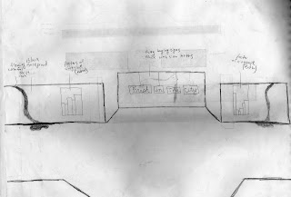
This is an original rough sketch of the background location for Liberty Universitie's first official fashion show. I was the chairman for the interior design group, tasked with designing a backdrop and theme for the fashion show. Our concept was, "Fresh In The City" for the very reason that spring was approaching, and the colors that year were fresh and colorful. We also included some clean city scape photographs that we used for decoration.
The sign that reads Fresh In The City was not posted on the wall as you see here, rather, it was hung right above head level in between the other two partitions. This gave the models a grand entrance, introducing them to the audience. The pools of fabric were a beautiful sheer aqua that draped across the partition and pooled onto the floor. I wish I could say that everything was perfect and went according to plan, however, it did not. The fabric was very difficult to hang in the room. The signs also proved to be very arduous. Nonetheless, we accomplished our task by compromising some of our original ideas.
I learned a great deal from this experience. One important lesson, was learning that you need to know for sure how you are going to join things well in advance of the final project.


Thursday, November 8, 2007

Library Organization


Organization. My middle name some may say. I spent a long time on my friends entire library organizing every single book. Each book in the entire library has a specific spot. It was mostly arranged by genre but some were placed solely on aesthetics. We did want to make sure the library was still functional.

Antique Chandelier


This was another project I did for my friend. Because of my experience from working at S & W lighting I was able to find the replacement crystals, and have some of my former co-workers re-wire the lamp. As a result, the fixture now had clear wire and a complete set of crystals. Furthermore, we also cleaned all of the crystals to give the beautiful fixture the complete makeover. To bring the project to a close I installed the medallion you see on the ceiling.

Cherub


Now, I did not design this landscape feature, but I do really like how it stands out amongst the ivy. The way the sun shines on the cherub is really angelic in appearance.

Cabbage anyone?


This is some decorative cabbage that I planted for the fall. There are a few of these pots placed all around the patio as well as some pansies and marigolds. These flowers are all beautiful and I love to see how they liven up the exteriors of homes. It is also really rewarding to see the plants grow into full, healthy, mature plants.

Heritage Bloom


From generation to generation, this rose bush is being passed on. It is very exciting to to inquire how many more generations this rose bush may see. This is one of the first blooms from the American beauty rose bush we transplanted. It is so very beautiful.

American Beauty


This is where it all began. This summer I had an older couple, who were also my friends, who needed some help around their house. The first need required some landscaping and gardening remodeling, which brings us to the rose bush. This rose bush is a very old American Beauty. We transplanted it from the owner's mothers house, and brought it here to my friends backyard. The trellis was bought from Lowes Home Improvement and was the only aesthetically pleasing trellis for sale at this time.

Self Portrait


Here is another view of my self portrait project. You can see how my organization characteristic comes through.

Inverted Plants and Stairs


The more I play with Photoshop the more I am flooded with ideas for my photos and projects. These two drawings were done with pencil on white paper. However, with the nifty use of Photoshop I was able to transform these drawings into black and white drawings.

Black and white


Over the past week the IAR students have been learning different techniques in shading. Thus far, we have been shading on white paper with pencils only. Here we were required to complete a shading by observing the white values instead of the dark. I took a shading I had already done in black and white and turned it into a white value drawing. I really like the effect it gives.

Tuesday, November 6, 2007

Still Life


Shady Stairs

I really enjoy shading with the pen. For some reason the drawings I do using the pen really turn out well for me. One reason I appreciate the pen, is that I enjoy the blending of values that result from the use of the pen. For example, the box below with the shadow coming off of its face really produces a appealing effect. I have always had a great desire to be able to reproduce a transparent effect in my drawing. So, to be able to do so is really enjoyable for me.

Thursday, November 1, 2007

Geometric Shades


After having been thrown into the deep end of the shading exercise pool, we returned to our text book, and read the chapter on tones and values. It was very beneficial, as I am sure you can see. In these two shading exercises the crosshatching, hatching, and scribbling techniques for shading were used. I also wanted to show you the difference photo shop can make. Different effects can be achieved depending on the feel or mood you are trying to portray. If I want a more dramatic and intense contrast to be shown I will use the drawing on the top. On the contrary, if I want a more subtle feel I would be more inclined to use the drawing on the bottom.